How to Read the HTTP Tweak Dashboard: A Simple Guide to Your Configurations
Learn what each HTTP Tweak Dashboard card, chart, and table means so you can monitor configuration reach, connection reliability, and app activity with confidence.
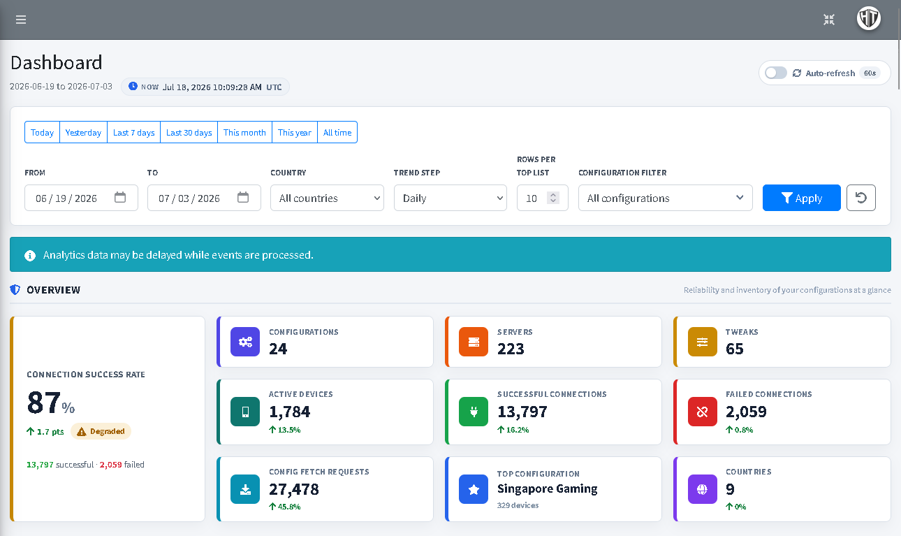
The HTTP Tweak Dashboard is a simple place to check how your own configurations are being used. It brings together your configuration list, connection results, app activity, and simple trends so you can spot what is working well and where to look next.
You do not need to understand every number at once. Start with the date range, look at the success rate, then use the tables below to answer one question at a time: Which configuration is being used? Is it connecting well? Which server, tweak, tunnel type, or country needs attention?
The Dashboard shows data for the configurations you currently own. It does not show another user's configurations or their activity.
Start with filters
The filter bar controls every card, graph, and table below it. Choose the view you need, then select Apply.
Choose a date range
Use Today, Yesterday, Last 7 days, Last 30 days, This month, This year, or All time for a quick view. You can also choose your own From and To dates when you want to investigate a specific period.
For a normal check-in, start with Last 7 days. Use Last 30 days when you want to see whether a change is improving or getting worse over time.
Narrow the view when you have a question
- Country shows activity from one country only. Leave it on All countries for the full picture.
- Configuration filter focuses the whole Dashboard on one of your configurations. Use it when a customer or team reports a problem with one specific configuration.
- Trend step changes the chart grouping. Daily is best for short periods; weekly or monthly makes a long period easier to read.
- Rows per top list controls how many entries appear in the ranked tables. It does not change the total activity being measured.
The reset button returns the page to its normal view. Auto-refresh is useful when you keep the Dashboard open on a screen; it refreshes the displayed data every 60 seconds when turned on.
Important: Dashboard data can arrive a little later while the app activity is being processed. Treat a recent blank spot as a reason to check again, not as proof that a configuration has stopped working.
Understand the overview cards first
The overview gives you the quickest answer to “what is happening right now?” The big Connection Success Rate is the first number to check. It compares successful connection reports with failed connection reports during your selected date range.
For example, if there are 80 successful reports and 20 failed reports, the success rate is 80%. A green upward number beside the rate means the rate improved compared with the previous period of the same length. A change shown in points is a change in the rate itself, not a count of new connections.
The other cards mean:
| Card | What it tells you |
|---|---|
| Configurations | How many of your current configurations are included in the view |
| Servers | How many servers those configurations contain right now |
| Tweaks | How many tweaks those configurations contain right now |
| Active Devices | The number of different devices that used your configurations in the selected period; one device is counted once even if it connects many times |
| Successful Connections | Connection-success reports from the app during the selected period |
| Failed Connections | Connection-failure reports from the app during the selected period |
| Config Fetch Requests | How often the app asked for your configuration; this is activity, not proof of a successful connection |
| Top Configuration | The configuration used by the most different devices, not simply the one with the most repeated connections |
| Countries | The number of countries shown by connection activity in the selected period |
Do not worry if the cards use different units. That is intentional: a connection count, a device count, and a configuration fetch count answer different questions.
Read connection reliability over time
Use this section when you want to know whether people are connecting successfully and whether the situation is changing.
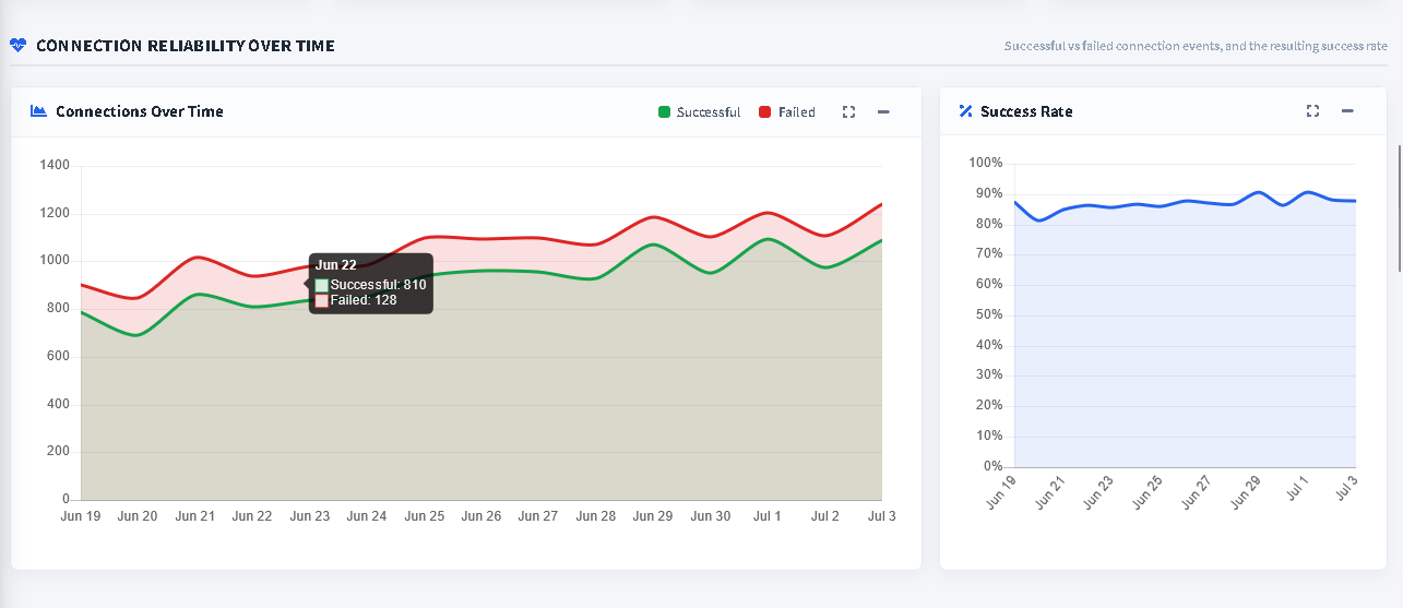
Connections Over Time
The green line shows successful connection reports. The red line shows failed connection reports. Move over a point on the chart to see the numbers for that day, week, or month.
High activity is not automatically good or bad. Look at the two lines together:
- Green rising while red stays low is usually a healthy sign.
- Red rising sharply while green stays flat is a reason to investigate.
- Both rising can simply mean more people are using the configuration; use the Success Rate chart to see whether reliability is holding up.
Success Rate
This chart turns the same successful and failed reports into one percentage. It is useful because it makes a reliability change easier to see even when traffic volume changes.
If the rate drops, use the next section to find where the failed reports are concentrated. Do not change every setting at once. First identify whether the problem appears around one configuration, server, tweak, tunnel type, or country.
Use Connection Diagnostics to find the problem area
Connection Diagnostics ranks activity by connection reports. It helps you answer “what is being used most?” and “what is failing most?”
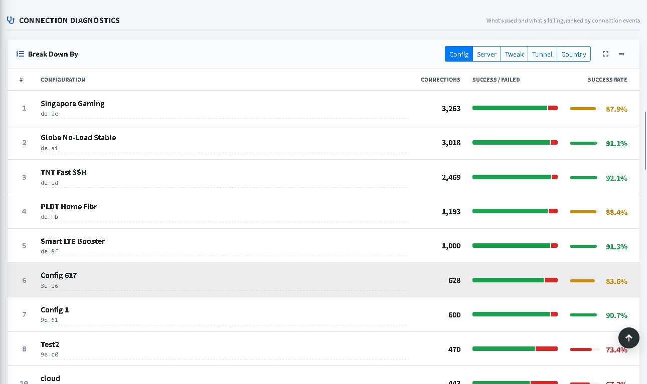
Choose one of the buttons at the top of the table:
- Config compares your configurations.
- Server compares the servers inside them.
- Tweak compares the saved connection methods.
- Tunnel groups activity by tunnel type.
- Country groups activity by the country reported for the connection.
Each row has four useful parts:
| Column | How to read it |
|---|---|
| Connections | The total number of connection reports for that row |
| Success / Failed | The green-and-red bar shows the balance between successful and failed reports |
| Success Rate | The percentage of successful reports for that row |
| Rank | The highest connection activity appears first |
Start with a row that has meaningful activity and a lower success rate. Then switch between Config, Server, Tweak, Tunnel, and Country to see whether the same pattern follows one part of the setup. A small number of reports can move the percentage quickly, so use the total connection count beside it for context.
Do not confuse connections with devices
The next section is deliberately separate from Diagnostics. Popular Configurations by Devices ranks configurations by the number of different devices that used them.
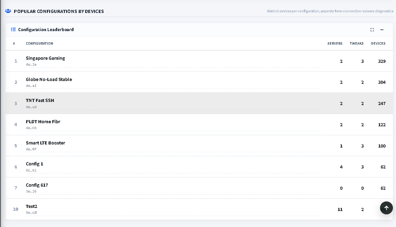
A device that connects many times still counts as one device here. This prevents one very active device from making a configuration look more widely used than it really is.
Use this table when you want to understand reach:
- Which configuration reaches the most different devices?
- Does a configuration have enough servers and tweaks for the people using it?
- Did a new configuration begin reaching users after you shared it?
The Servers and Tweaks columns are the current items saved in that configuration. The Devices column is the number of different devices seen in the chosen period.
Check configuration fetch demand
Configuration Fetch Demand shows how often the app requests your configurations. It is useful for understanding interest, imports, updates, and normal app activity.
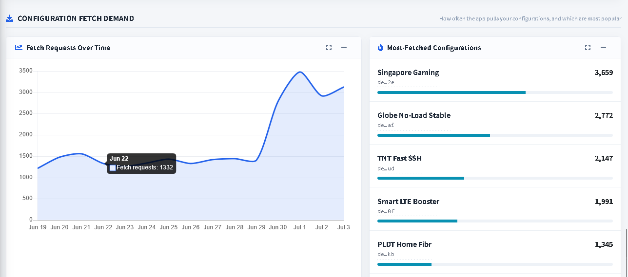
The chart on the left shows fetch requests over time. The list on the right ranks the most-fetched configurations for the same filters.
A fetch is not the same as a successful VPN connection. Someone may fetch a configuration without connecting, and a person may connect several times after only one fetch. Treat fetch demand as a usage signal, then compare it with the reliability and device sections before making a decision.
For example, a sudden fetch increase can be a good reason to check the success rate. If demand rises and the failure rate rises too, review Diagnostics before sharing more copies.
Check Client App Versions before supporting an issue
The Client App Versions table shows which app versions are being used with your configurations. It is especially useful when an issue seems to affect only some users.
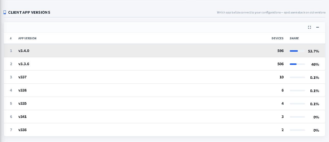
Use it to see:
- which app version is used by most devices;
- whether many people are still on an older version;
- how large each version's share of activity is.
If a problem is reported by users on one older version, ask them to update the app before changing a configuration that works for most people. The table is a guide for better support conversations; it does not by itself prove that an app version caused a connection problem.
Follow each configuration's health trend
Per-Configuration Health gives each of the leading configurations a small activity chart. It shows how many different devices were active for that configuration over the selected period.
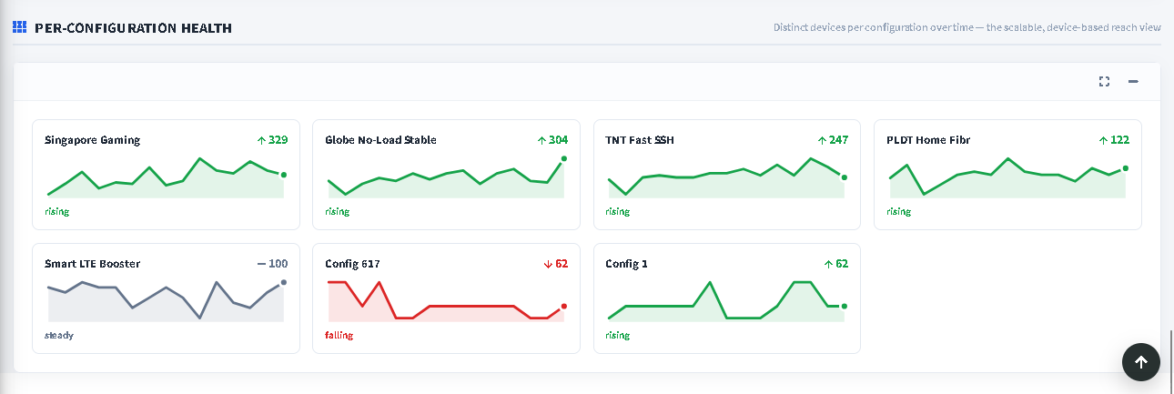
The labels are simple:
- Rising means the later part of the selected period had more device activity than the earlier part.
- Falling means the later part had less device activity.
- Steady means activity was broadly similar.
These labels describe reach, not connection quality. A rising configuration can still have a poor success rate, and a falling configuration can still be reliable for the people who use it. Use the health cards together with Connection Reliability and Diagnostics.
A simple weekly Dashboard routine
- Choose Last 7 days and leave the country and configuration filters open at All.
- Check the Connection Success Rate and whether it moved up or down.
- If the rate dropped, open Connection Diagnostics and start with the configuration rows that have both activity and a lower rate.
- Switch to Server, Tweak, Tunnel, and Country to see whether the pattern becomes more specific.
- Check the device leaderboard and Per-Configuration Health to understand whether the affected configuration is widely used or changing in reach.
- Check Fetch Demand and Client App Versions before deciding what to communicate to users.
- Make one tested change at a time, then return to the same date range later to see whether the result improved.
When the Dashboard looks empty or unexpected
An empty chart or table does not always mean that a configuration is broken. Check these first:
- Make sure the date range includes the activity you expect.
- Clear the country and configuration filters to return to the full view.
- Wait a little and refresh if the Dashboard says data may be delayed.
- Confirm that the app has had real connection or configuration activity to report.
- Remember that a deleted configuration no longer appears in your personal Dashboard view.
Frequently asked questions
Does the Dashboard show every configuration on the platform?
No. It is a private view of the configurations you currently own and their activity.
Why is the device leaderboard different from Connection Diagnostics?
Diagnostics ranks connection reports. The leaderboard ranks different devices. One device can create many connection reports but still count as one device in the leaderboard.
Is a configuration fetch the same as a successful connection?
No. A fetch means the app requested the configuration. Use the Successful Connections card and the reliability charts to understand actual connection results.
Why did the success rate change even though the total number of connections is small?
With only a few reports, one success or one failure can change a percentage a lot. Always read the rate together with the connection total.
Can I use the Dashboard to prove that a server is down?
No. The Dashboard helps you spot patterns in reported activity. Use it to decide where to investigate, then test the relevant configuration, server, and account with the authorized provider or your own infrastructure.